


Share:

.svg)
.svg)
Developer Experience (DX) is the equivalent of User Experience (UX) when it comes to a developer.
It’s essentially the experience, a developer goes through when making use of software products like APIs, SDKs, Client libraries, and other such tools and services. At APIMatic, we wanted to streamline the API consumption process and put all our efforts into the Developer Experience Portal to achieve that.
There are a number of services that can generate either SDKs, Documentation, or some other sort of help material to make APIs easy to work with. But none that consolidates it all on a single platform like our Developer Experience Portal. It’s a one-stop all solution for all your API needs, including SDKs in multiple languages, Language Specific Documentation, Reactive Code Samples, Test Cases, CI/CD integrations, Package publishing, and on top of that a beautiful, navigable 3 column UI, which is a pleasure to work with.
Design and usability are not something people talk about when building products for developers, but the design is more than just aesthetics, it’s about effectively delivering your functionality to the end-users.
In this blog, we’ll discuss the thought process behind the design of our Developer Experience Portal, what we built and how we put it into existence.
Adding Developer Experience Portal into Existing Information Architecture (IA)
Adding the developer experience portal into our existing information architecture was the first step. Information architecture helps bring everyone in the team on the same page — from the stakeholders giving requirements to the design team, the dev guys, and the ones who are testing everything.
Making a Basic Wireframe
After the information structure was updated, wireframes for the DX portal had to be made. A couple of brainstorming sessions and paper mock-up iterations helped in making basic wireframes for the portal — thanks to the dev team.
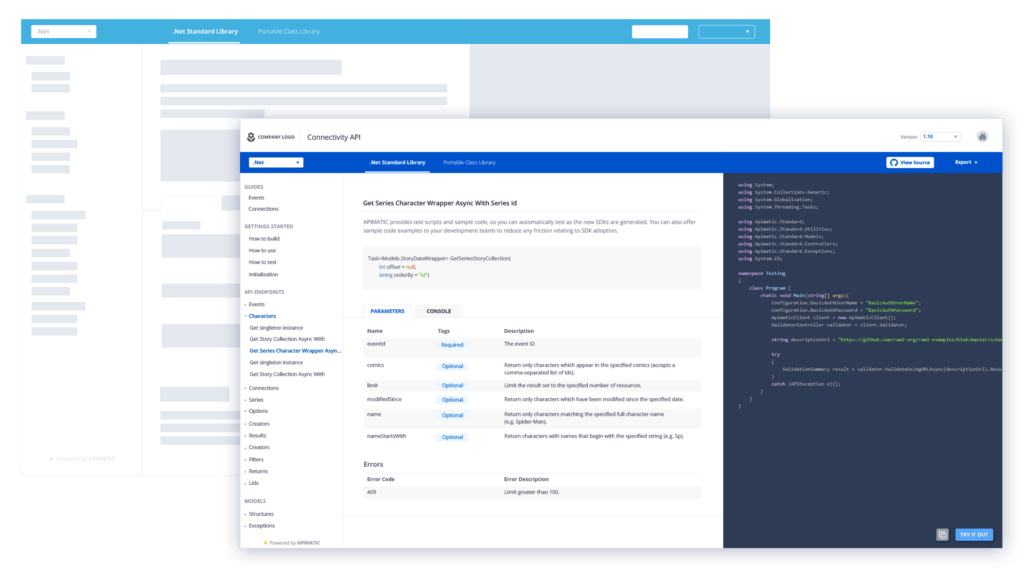
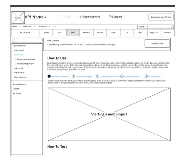
In this case study, my focus is going to be only on the documentation page. This is the wireframe that we came up with for the said page.
Converting Wireframes to Mock-ups
Based on ground level information, we got the wireframes. Beauty of a good UX process is that it is incremental in nature. So, you get really excited at every iteration but still keep iterating till you get the most stable form.
Wireframes are there to get you started. Don’t put extra effort to get the perfect information/requirements in the beginning. Specially in a fast paced company where you need to rapidly prototype and ship features as early as possible.
Moving on…we converted the wireframe into a mock-up without bothering too much about the design at this stage. The first step is to place all the elements pointed out in the wireframe and add some basic colors to it.
Since product design is an iterative process, we toned down the wireframe to implement a basic version of the mock-up — stripping out some of the items visible in the wireframe. Like the search bar, the navigation bar with API Name and other information, the navigation bar with the breadcrumbs and version information. All this was planned to be added in a later iteration.
So, this is the initial mock-up that we ended up with after wireframe conversion.
Mock-up Testing is a Thing
Testing is usually referred to a running software. However, it’s a pretty important step in the design process. Testing mock-ups saves a lot of time and cost. A visually beautiful but functionally disastrous mock-up can get initial approval in no time but can become a serious bottleneck during development.
So we just propagated the first mock-up within the team to get feedback — not about the design, but about the features it included.
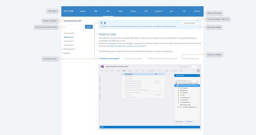
Based on feedback and secondary brainstorming, we got rid of some unnecessary elements and took care of some other requirements. A better cleaner version was achieved.
Few basic UI tricks pretty much worked but we came across other few functionalities that our mock-up lacked. For example, Transformer is another feature that allows users to convert and export their API specifications into a number of formats. We needed to somehow add that into the mock-up too.
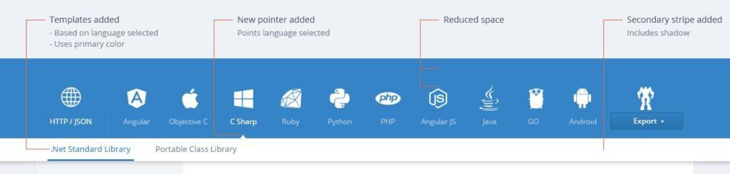
We also noticed that all languages listed were competing against each other visually. The increasing weight of the selected element does the work but it’s better to lower down the opacity of the remaining elements. This not only makes the selected element prominent but also lowers down the overall weight.
While we were still in the process of testing the mock-ups, we came across the requirement that there were templates against every language that was to be available for selection. Therefore, we needed to add a selection hierarchy to the mock-up as well. So, we added templates and a secondary selection stripe and removed the space above the languages listing, which wasn’t being utilized.
Reiterations and Design Improvements
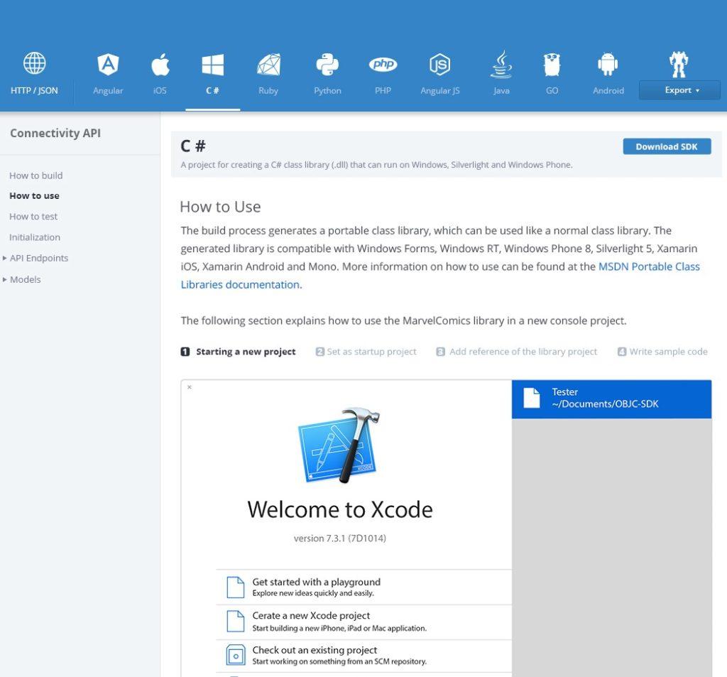
We, at APIMatic, believe in constantly improving our products. Soon the team took the decision to add some additional features to the portal and that required some massive changes to the UI. An all-new API console and Reactive Code Samples were the biggest reason behind that massive overhaul. We didn’t waste any time and to accommodate the new requirements, we moved from the fixed-width design we already had and decided to go with the full width one. We also improved the left navigation and the overall typography of the portal.
At this point, we were quite satisfied with the results but kept on questioning our design like how to make it sleeker as well as more functional.
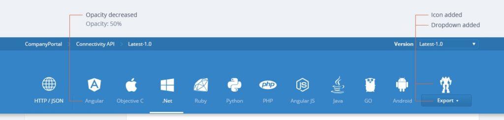
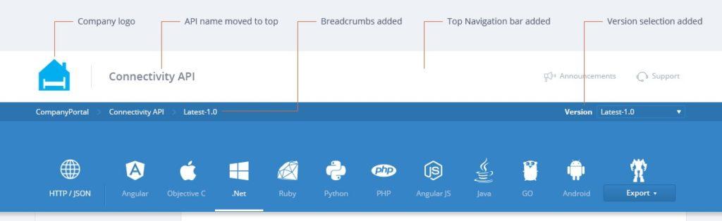
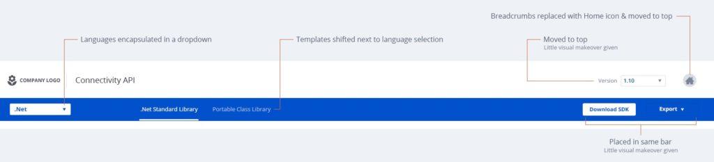
Eventually, we realized that we were using too many navigation bars on top. Four navigation bars sound even more ridiculous than it seems. We tried to minimize that in our next iteration by putting languages into a drop-down and listing templates next to the drop-down.
We decided to get rid of the language icons again as they were taking a lot of space.
Furthermore, the Download SDK and Export buttons were placed on the same bar. The breadcrumb bar was also taking space and it wasn’t very useful as there was only one navigable page before it.
So, to tackle that we converted that into a home button and put it on top. Version selection was also shifted to the top bar.
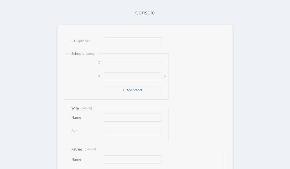
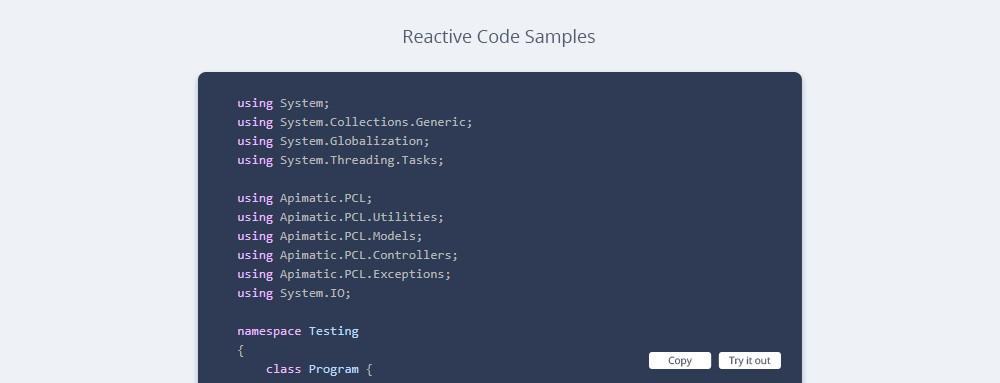
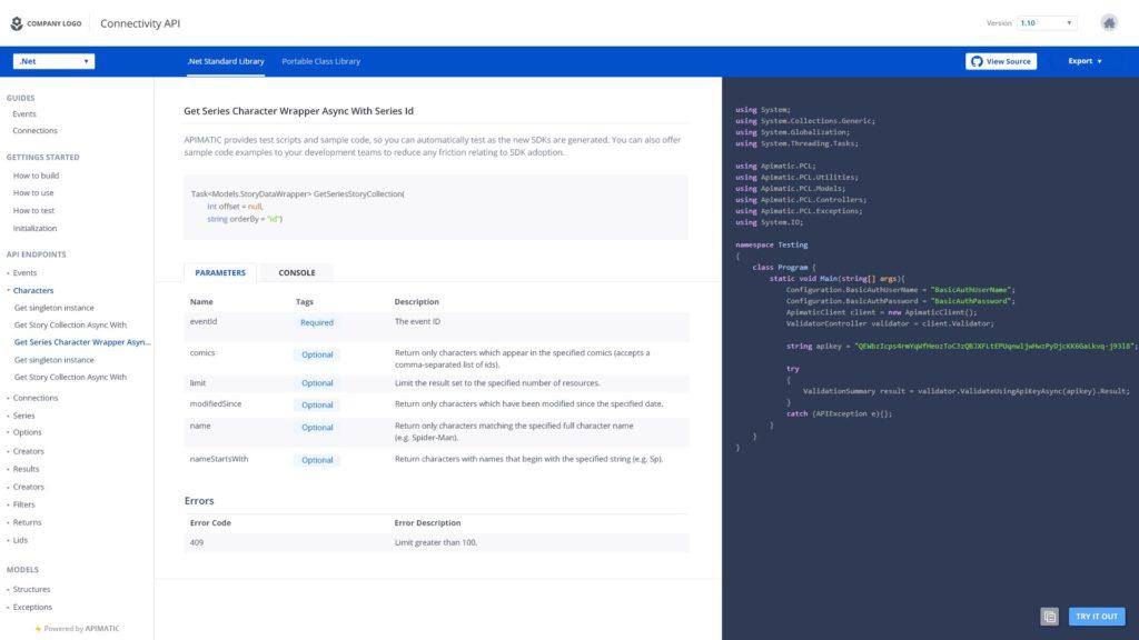
Another thing that was bothering the users and us as well, was the console and the code samples being in the same column. On smaller screens, both appeared very congested and using the console with such a small height was really a bad experience.
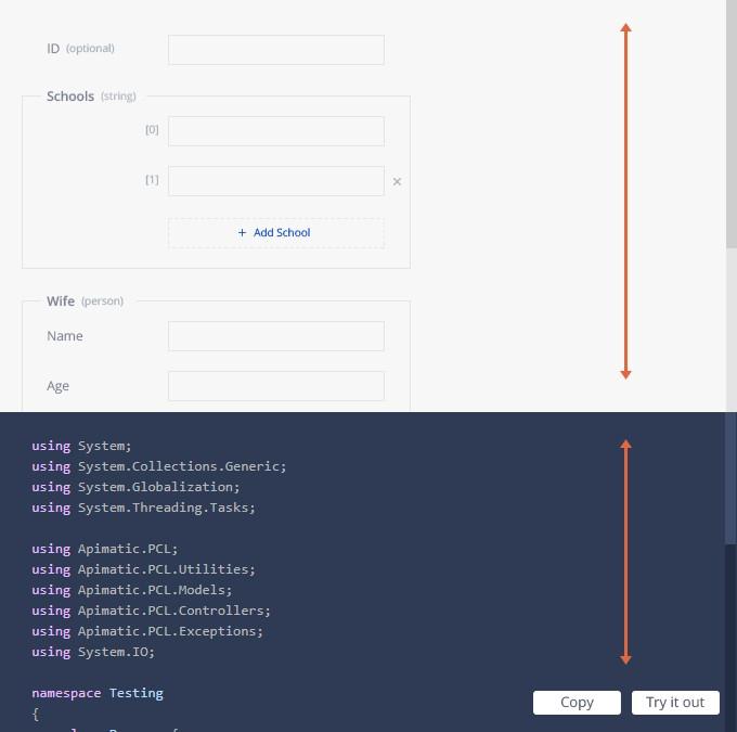
We decided to place the console in the center column which gave a lot of breathing space for both.
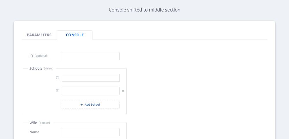
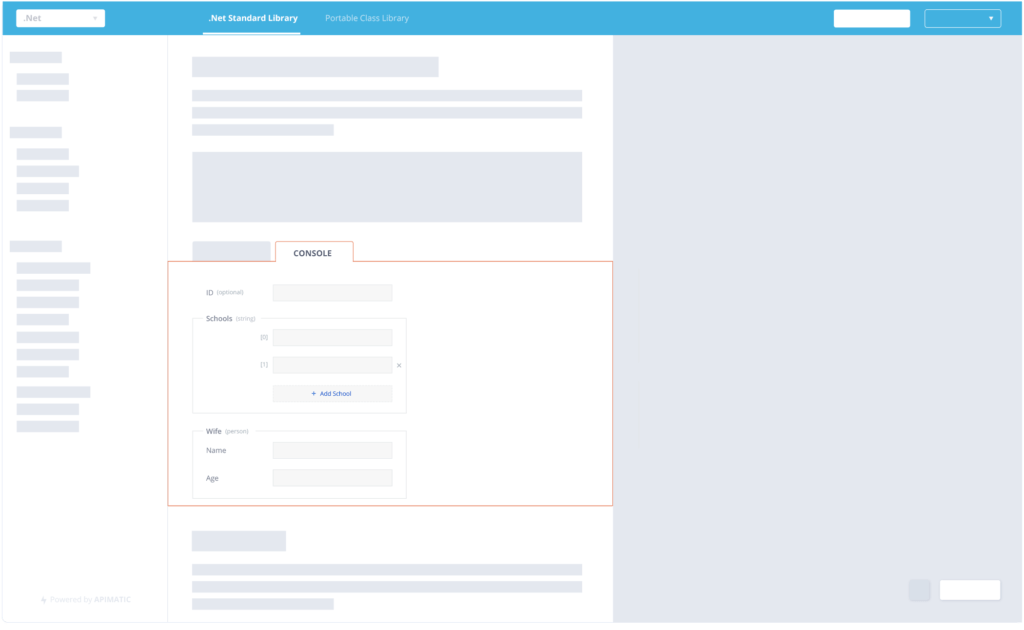
Following is the form we got after putting the console in the middle column. We also gave a makeover to the “TRY IT OUT” and “COPY” buttons on the bottom right.
Conclusion
Once you’ve released a feature, you make design and flow decisions based on how people are using it. We use a tool that provides us with real-time user interactions. It enables us to see how people are interacting with our product. It is really helpful in making design and flow decisions and helped us improve upon the design of our product.
We are glad to be moving in the right direction with our UI and intend to keep on improving the UX and the DX of our products. We believe in the concept of making things easier for developers and always design our products accordingly.