Share:

.svg)
.svg)
“UX should be transparent and not opaque”.
Before crafting the user flows of any product certain goals are defined. User goals may include exporting file in a specific format, posting content over web, watching a video on a certain platform etc. There can be multiple goals for a user in a single product too. In our case user could achieve multiple goals. When it comes to a complex data driven software product one has to make sure the user journey is flawless and fluent.
Talking of transparent UX and User Goals. User interface should never come in the way of user and its objective.
Let’s talk about the product I worked on recently.
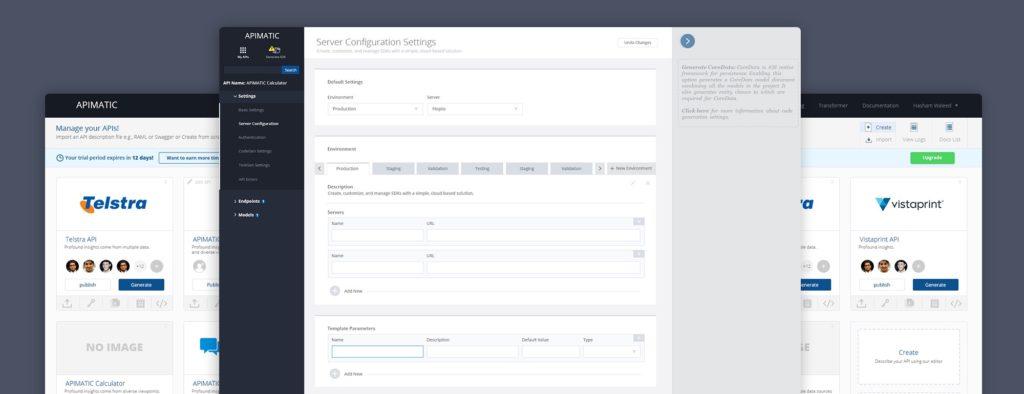
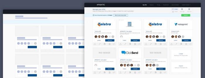
Developer specific product can have a lot of complex user goals which could result in even more entangled user flows.
To gather requirements one needs to talk to the product owners and the potential users. In my case, since I worked at the same company and product being developed for the developers I had the future users all around me. All I had to do was like talk to them and understand their needs. This introduces another problem on the way. Dev guys start giving you irrelevant input and start taking interest in the design itself, which can have fatal results.
Once the requirements were gathered, wire-framing took place. Personally I recommend paper pencil as the best wire-framing tools of all time. The freedom and flow that you get using paper as a medium is out of this world.
Converting those rough ideas into proper design is the part where you need to be very careful. Best practices include creation of the design conventions and defining some rules and boundaries. From border width to color codes every thing should be defined to sustain throughout the product since consistency is the key.
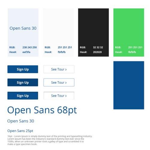
Defining the design guidelines for the whole product makes it lot easier to curate new pages without compromising the consistency. Design guidelines are build around the product branding constraints. In some cases this style guideline helps build the product’s visual identity.
On another level if we come to think of it, design guidelines basically bridge the gap between the designer and the front-end developer. The developer doesn’t have to bother design team for color codes and stuff.
“Brave designers design for zero data”
Although it is my own quotation I still strongly appreciate it. Call me self-obsessed. Yes, you heard me right. Every designer is self obsessed which is a good thing I believe as far as confidence is concerned. Although in case of User Experience Design this self obsession can be fatal for the product. For example designers while designing the experiences tend to come up with the best looking mock-ups in order to be praised by the Project Owner or to just get more appreciation over platforms like dribbble and behance. In this race the main purpose of design gets lost.
“Design is the process of solving problems and not only about the visual appeal”
I mentioned “design for zero data” before. It is pretty clear that the product itself without any data won’t be as flashy as the mock-ups appeared which will clearly disappoint the product owners and other people around. Design with zero data is hard to swallow but has way better value. Starting from the zero data means troubleshooting a lot of UX issues that would arise later.
“Users are the tourists, UI should guide them”
In our product we made sure that we guide user at every step. At the same time we made sure that the user doesn’t get annoyed. Using the minimal approach we used notification stripes instead of popups. Popups are annoying and every UX designer should avoid using them.

Similarly colors must depict the results. One bad choice of color can mislead the user and can result in user frustration. Similarly conversion rate is directly linked to the CTA. CTA must be different from rest of the design and should be the first thing user should be looking at.
Talking to the real world users is the way to curate experiences. Even a bad feedback is blessing.